MGM
Pharmacies
Visual Identity
Signage
Unifying several pharmacies into one brand.
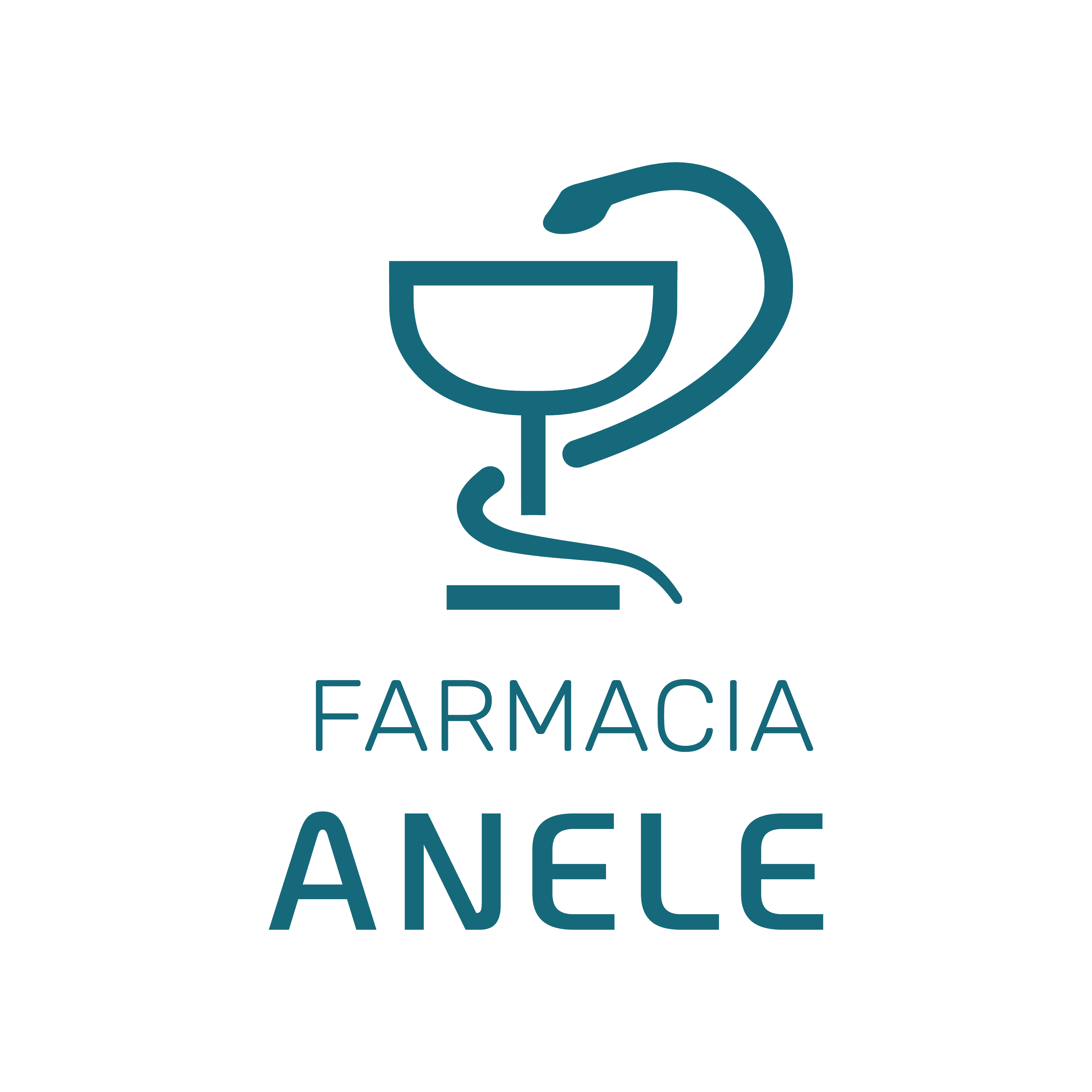
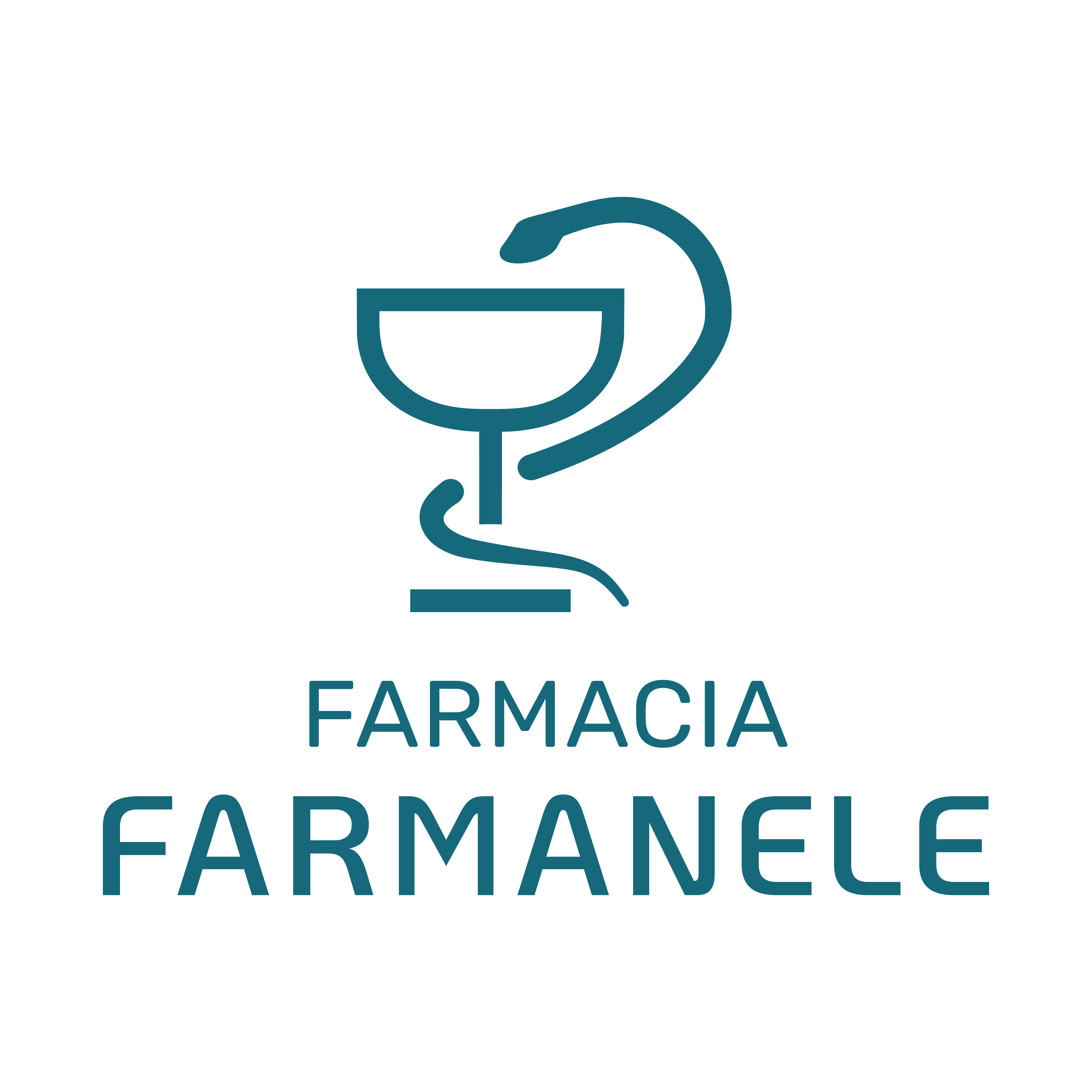
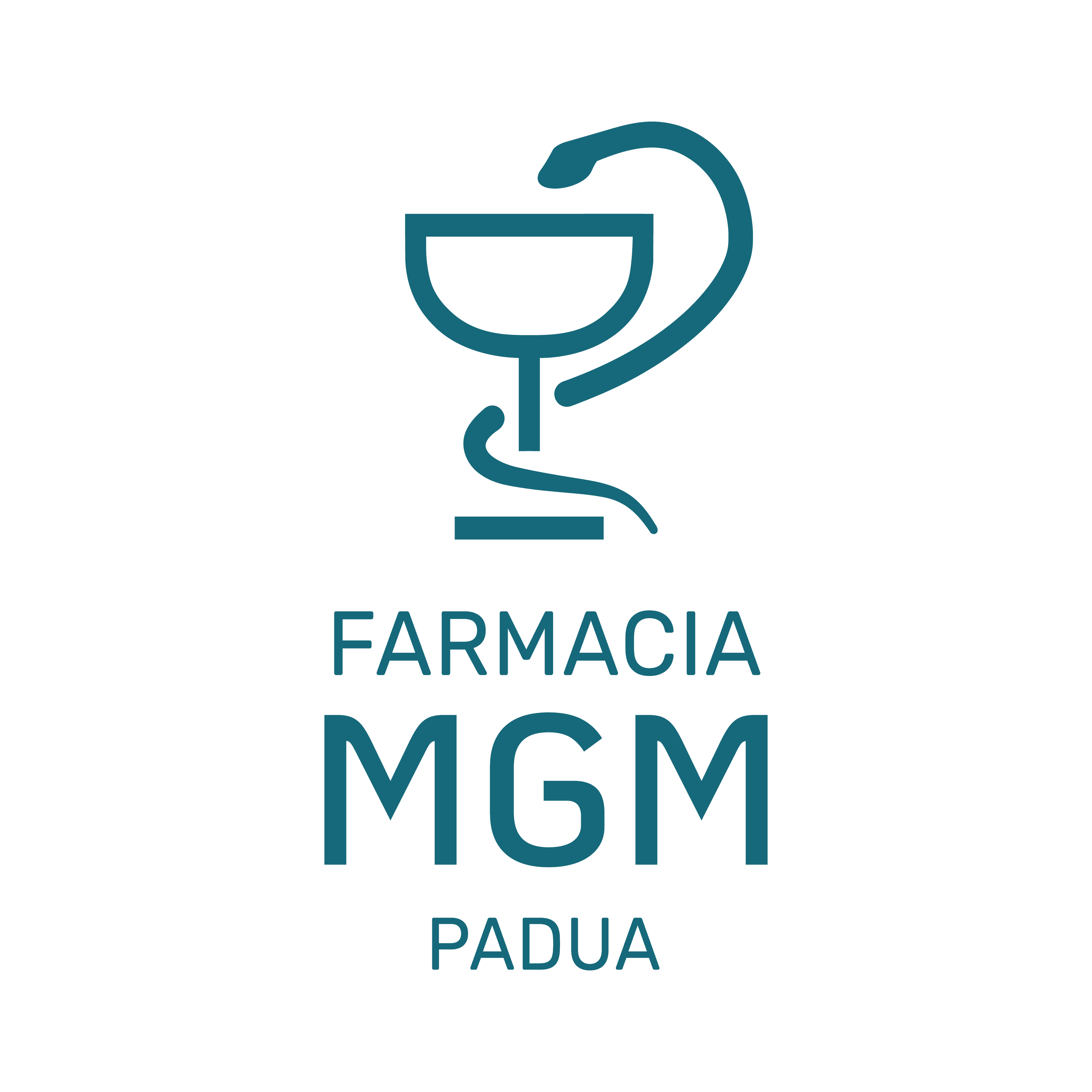
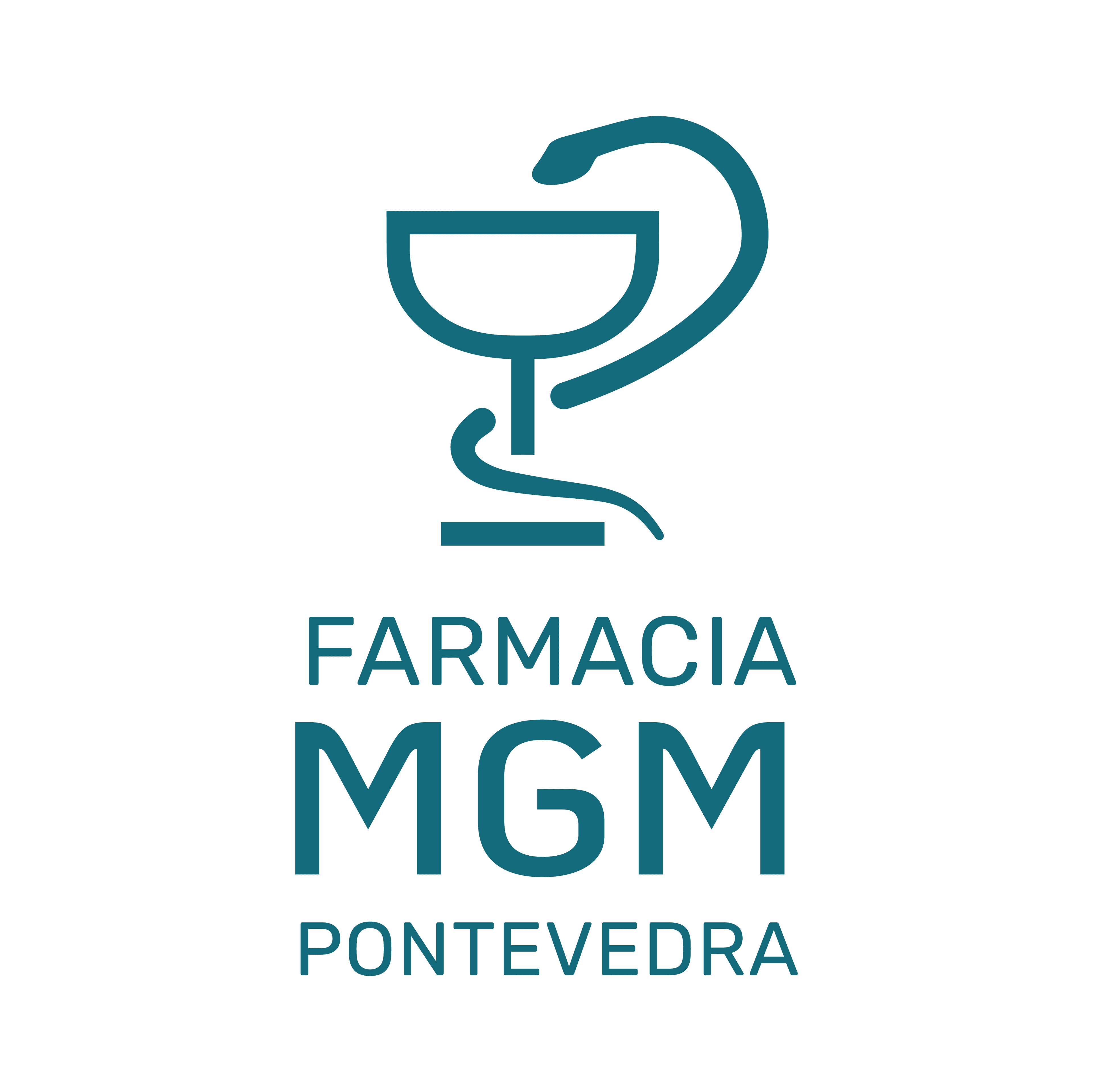
MGM is a chain whose branches had each grown on their own: different names, different logos and a look that no longer held together. The recognition was there, but the brand felt scattered and dated.
We took on a full rebranding: a shared symbol —the Bowl of Hygieia— and a consistent visual system that adapts to each pharmacy (Anele, Farmanele, MGM Padua and MGM Pontevedra) without losing its own identity. One brand, many doors.
Unified identity
A shared symbol and visual system for the whole group, keeping each branch's name. Consistency without erasing what every pharmacy already meant to its neighborhood.
Flexible system
One palette, one typeface and clear application rules that make it easy to add new branches without starting over. The brand grows with the chain.
Ready for the street
Logos built for signage, storefronts and digital pieces, designed to look great on a large sign or a social media photo alike.